


Effective Communication Microlearning
With the speed in which we now consume information, I predict that we will soon see an increase in the popularity of microlearning. Whilst microlearning has been around for years, it has not seen the spike in popularity that I believe was initially expected upon its creation. But, with the introduction of new software such as Adapt, Evolve and Articulate Rise (which at the time of writing this has just added a new microlearning feature), I believe we are about to see a boom in the number of corporate organisations requesting microlearning.
With this in mind, I set myself the challenge of creating a 5-minute microlearning using Articulate Rise. I chose the topics of ‘effective communication’ as this is popular subject matter for the corporate sector and is something I am well versed on.
Whilst this was going to be a microlearning, I still wanted the course to feel visually impactful and to support a seamless learning experience. In essence I didn’t want it to feel like just another Rise course, instead it needed to hook the learner in straight away.

PROJECT DETAILS
Role: ELearning Developer and Instructional Designer.
Brief: creation of a 5-minute microlearning course.
TOOLS
Articulate Rise.
Articulate Storyline.
Affinity Designer.
Affinity Photo.
SKILLS
ELearning development.
Graphic design.
Instructional design.


My response to the brief
-
Create a 5-minute microlearning on the topic ‘effective communication’.
The microlearning should be visually impactful and use interactivity to support the learning experience.
The microlearning needs to be accessible, therefore colour contrast and tab order should be considered.
The microlearning needs to be responsive and accessible across multiple devices.
My initial response to the brief
I decided to use Articulate Rise for this microlearning due to their recent microlearning feature update. This is also a software I am comfortable in and I know it is device responsive too.
When planning an ‘illustrated’ microlearning, I always try to view it as one big page, therefore I plan and design it as one entity, similar to how you would a website page. Initially just putting in block placeholders to see how I felt the course would flow, before delving into some detailed instructional design.
Before cracking on with the development of content, I then decided on my colour scheme and font, ensuring the colour contrast met WCAG AA requirements.
-
As with any course I planned the content for this microlearning by defining the learning outcomes and key topics. As the microlearning is only 5-minutes, I didn’t want to shoehorn too much content into the course, therefore stuck to three relating topics, based on a what, why and how structure. This helps to position the content to the learner as ‘what - what am I learning today’, ‘why - why is this relevant to me’, and ‘how - how do I implement this learning’. This helps anchor the learning and keeps the structure clear and concise.
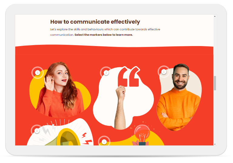
First the learner covers the what, I wanted to challenge their existing knowledge so encouraged the learner to input their definition of effective communication, before revealing the answer. For the ‘why’ I kept it to a short bulleted list of the benefits of effective communication. This helps position why the content is important to the learner. Finally the ‘what’ covers the key skills and behaviours the learner needs to adopt, in order to communicate effectively. For this I opted to use an image and marker block. This allowed me to add visual impact, without compromising on accessibility.
-
Unlike other Rise builds, I wanted to keep Storyline to a minimum in this microlearning. The reasoning for this is to ensure it is as device friendly as possible. Unfortunately Storyline does not translate well on mobile, therefore if the microlearning had too much Storyline within it, this would impact the overall learning experience.
I used a Storyline block for the ‘what is effective communication’ activity, as I wanted the learner to input their own thoughts. I designed this in Storyline so that it blends in with the surrounding Rise block and when viewed on a desktop or tablet, feels very integrated into the course.
For the rest of the microlearning, I made the most of the blocks within Rise. This is where visual design came in, to elevate the blocks and add interest.
-
It was important to me that the microlearning felt cohesive and visually striking. I wanted it to hook the learner in from the outset, therefore I designed a custom header to introduce the course. I kept the colour palette simple to avoid overloading or overstimulating the learner and drawing away from the content itself.
All imagery sourced was from stock websites, I then edited the images to be in-line with the colour scheme. This supports everything feeling more cohesive and avoids the imagery becoming too distracting, as it is there to support the content not deter away from it.
I used a range of circles, blobs and curved shapes to avoid creating a ‘blocky’ aesthetic. I used curved shapes to create dividers between sections and again make the course feel seamless and smooth.
-
The main challenge with this build was keeping the content clear and concise in order to not go over the 5-minutes. To do so I was sure to proofread my work and breakdown content into bullet points where necessary. To support this I used fairly simple interactions too, as interactivity that was too complex would have also pushed the course over the 5-minute limit.
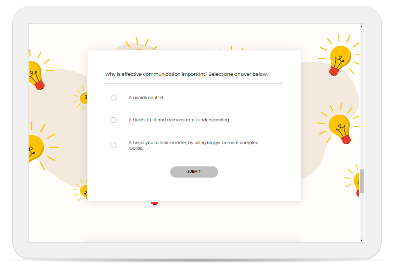
Another challenge with this was making sure the imagery translated well over devices. This was particularly difficult when designing the background for the knowledge check questions at the end of the microlearning. The knowledge check blocks can look very dull and boring if they have a plain background, therefore I knew I wanted to add some kind of visual aspect to them.
At first I tried an image of someone pointing towards the question block, but I found when I translated across the device views, this image was mostly lost behind the block, rendering it almost pointless. After some experimenting I decided to use a lightbulb pattern, as it is somewhat viewable across all device views, but if parts of it do get lost, it is not detrimental.
For the second question, as the block is slightly deeper, I was able to use two images of two individuals (one each side of the block). But to get the sizing and positioning right, I had to do a lot of trial and error, as when the learner answers the multiple response question the depth of the block increases which then impacts the image size. You lose the images on the portrait mobile view, but across all other device views the images work really well in enhancing these blocks.
Overall I’m really pleased with the finished microlearning and feel it is a good example of how even really short courses can still be engaging and impactful.